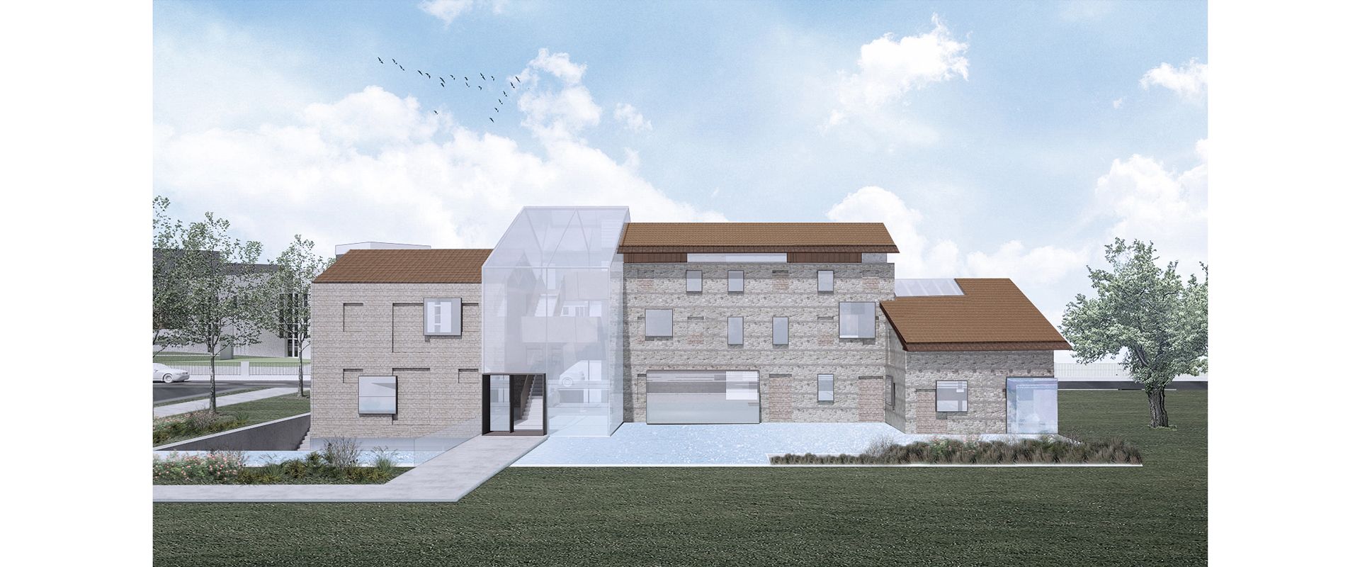
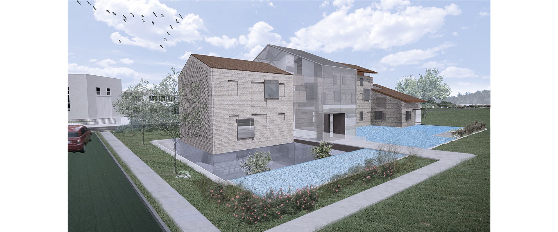
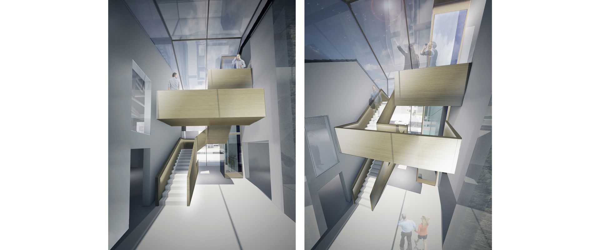
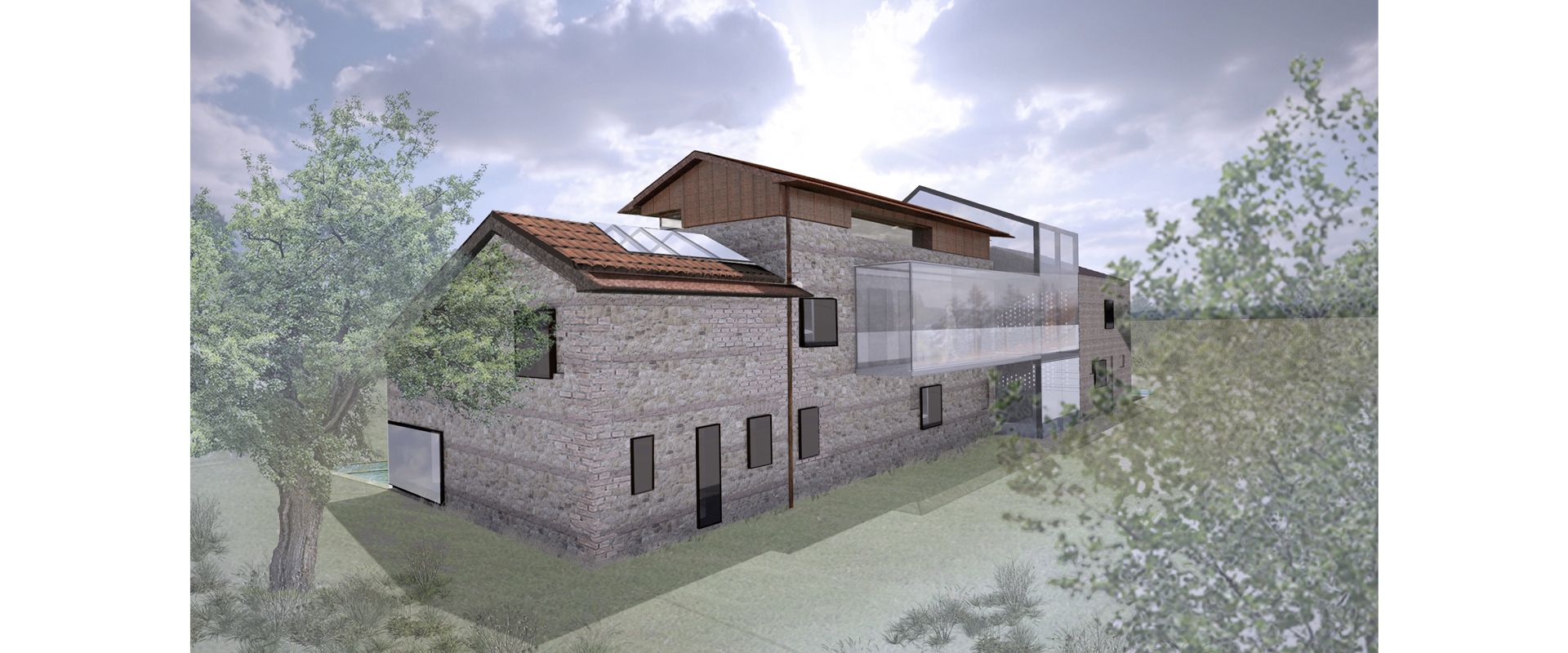
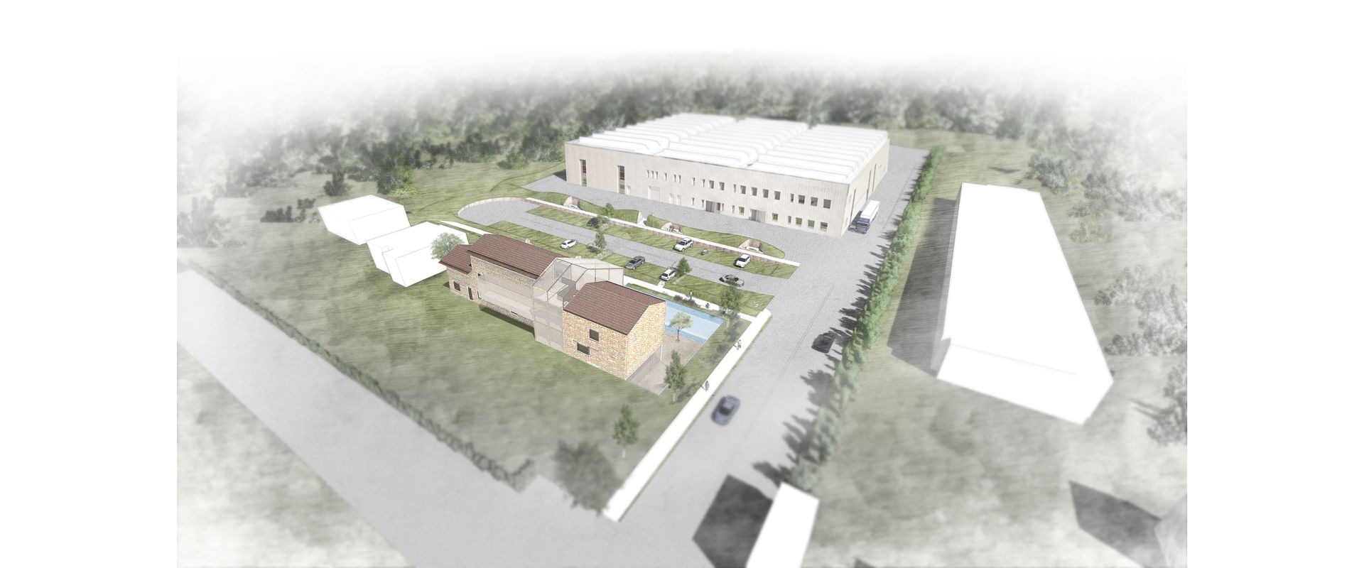
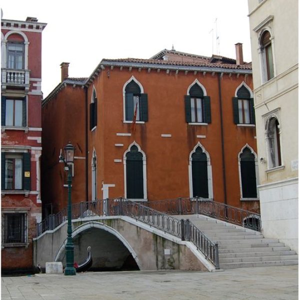
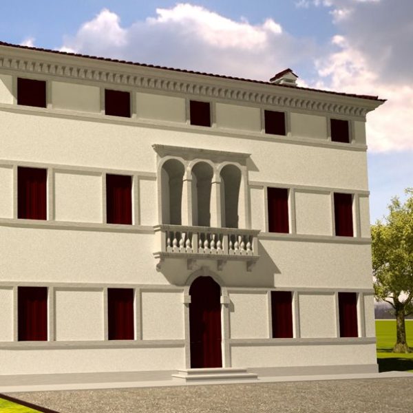
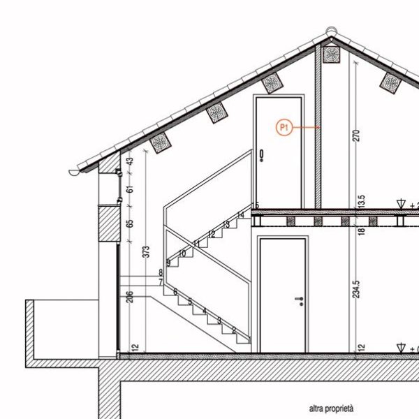
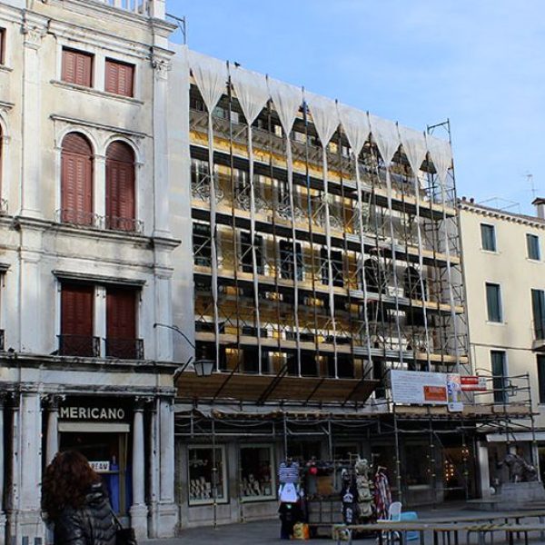
The project was born from the need of the company to obtain new offices, exhibition rooms and conference rooms by renovating and expanding a building. The design approach is based on the desire to maintain the legibility of existing facades through the use of different architectural languages that are deliberately overlapping, without mixing. The new openings, necessary for the new function of the building, are deliberately “deaf” compared to the previous project. In fact, the new is clearly identified to be able to better value the historical memory of the existing one, without incurring a “false” setting of the new directional function on the original residential building. The original height of the building will remain clearly legible, thanks to the inclusion of a glazed band that underlines the gap between the existing wall and the part that will be raised in the central portion of the building.
